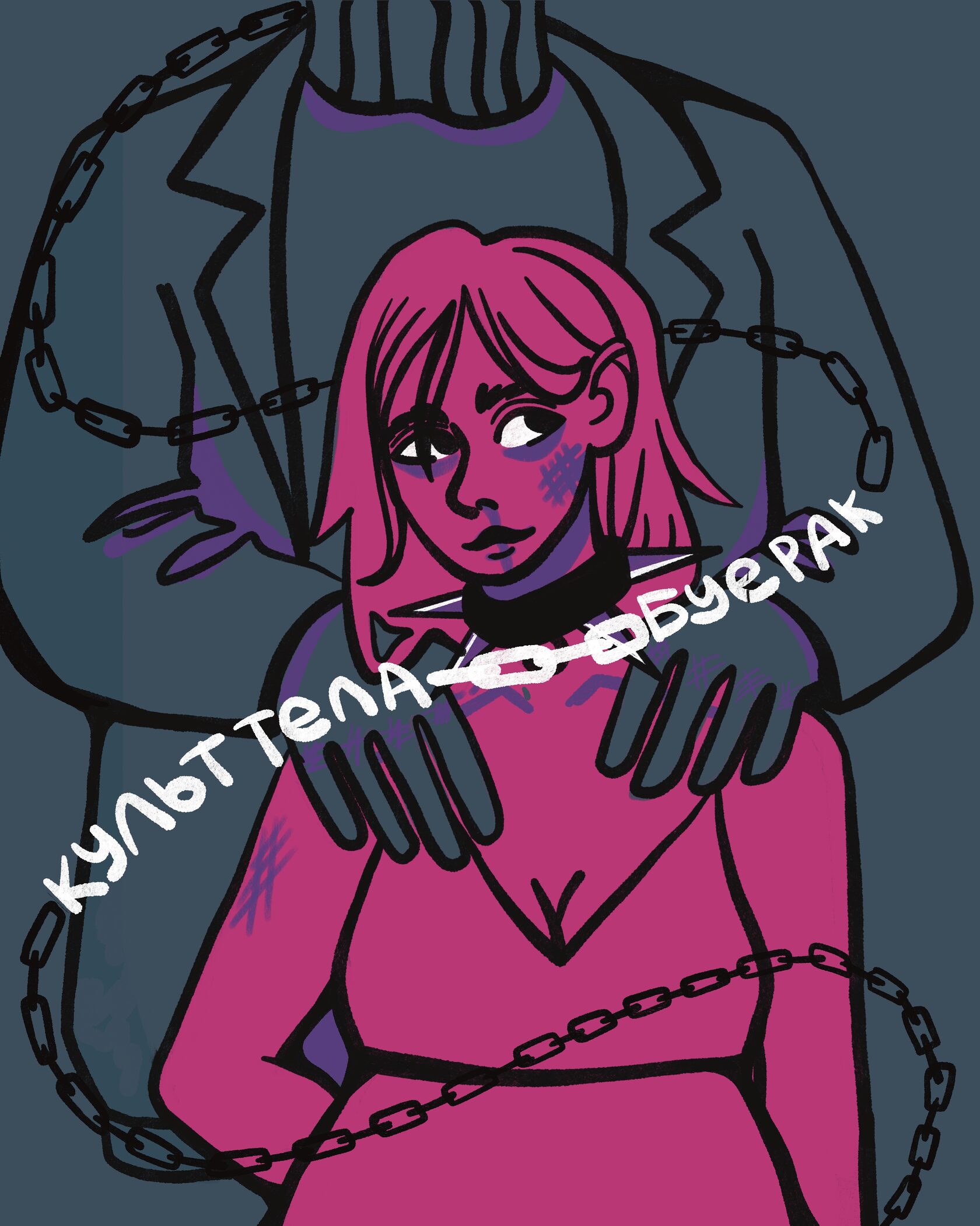


Niko Pukhova
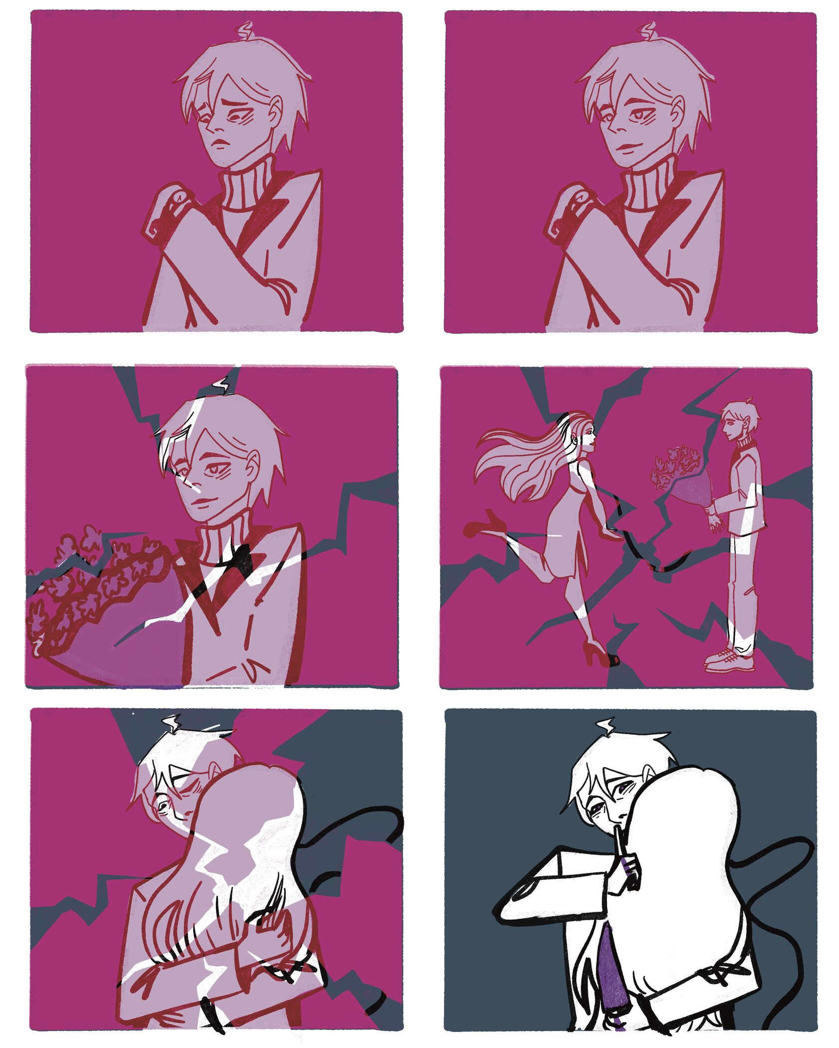
In crafting my artistic endeavor, my primary objective was to delve into an unconventional portrayal of love—one that traverses the realms of obsession, cruelty, and abuse. I deliberately sought to create a stark contrast with prevalent depictions of love in other artistic works, aiming to elicit a profound sense of horror and discomfort in those who engage with my creations.
Культ тела - Буерак
The strategic use of the color purple within the context of the comic and illustration serves as a symbolic representation, meticulously chosen to embody the aftermath of the depicted relationships. This hue, vividly splashed across the canvas, serves as a visual metaphor for the bruises and marks typically inflicted upon the victims of such twisted forms of love. The deliberate amalgamation of thematic elements, from the narrative exploration to the carefully selected color palette, endeavors to provoke introspection and visceral reactions, fostering a nuanced dialogue about the multifaceted nature of human relationships


my social media: